Apotheke Schaffhauserplatz
Digital health solutions: Make prescription drugs more accessible
The Schaffhauserplatz pharmacy in Zurich is specialised in prescription medicines. In order to make these more easily accessible online, it is launching the first online shop with the prescription drug PrEP.
Challenge
Anyone who wants to offer digital health solutions in the healthcare sector encounters complex challenges such as data protection and legal regulations. The purchasing of medicines online is subject to strict legal regulations and a complicated process. Customers have to sign and store their health data with the pharmacy. Data provided online by users must also be linked to an existing pharmacy data management system. Users should have the impression that this process is simple and intuitive.
How we got there
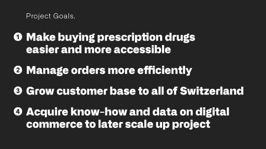
In workshops together with the team of the Apotheke Schaffhauserplatz we developed personas, defined the project goals, the UX and brand strategy as well as a user flow for the shop. It was decided to launch the shop as a pilot project for a specific drug in order to gain experience in digital health solutions. Based on these experiences and learnings, the shop should later scale to more products.
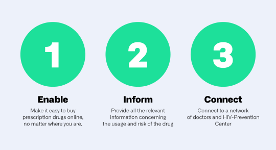
For the conception and implementation of the user experience, we defined three guiding principles on which we based the structure and content of the shop.
A rapid sprint to market
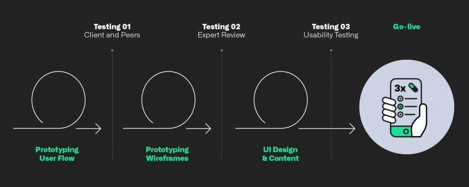
We have set ourselves an ambitious timeframe for the realisation of the project: from kick-off to go-live in just two months. To achieve this, we put together an agile, interdisciplinary team that worked on UX design, front-end and back-end in parallel through short iterative cycles and constant involvement of test users. We continuously improved the product through several usability tests with representatives from the target group.
Positioning of the Webshop
In terms of brand strategy, the PrEP shop is to be positioned differently from the umbrella brand Apotheke Schaffhauserplatz. This aims to avoid conflicts in the needs of the different target groups of the pharmacy. It was likewise essential to address the user group for the shop more directly and more appropriately. Nevertheless, the Apotheke Schaffhauserplatz should be perceived as the sender in order to build trust. We achieved this positioning through the choice of visual designs and language.
Visual Design > Simple, uncomplicated and fresh
Simplicity and user-friendliness were the focus during the development of the "Look & Feel". The functional use of colours and textures simplifies navigation in the shop. Emotionality and character influence the choice of fonts and images. Standalone illustrations and custom icons give the shop its own uniquely distinctive appearance.
Connection to the ProPharma data management system
Apotheke Schaffhauserplatz uses ProPharma's software to handle all its data management and medication orders. The shop therefore had to be connected directly to their system. We implemented this via a ProPharma web interface, which is served by a custom-developed module in the code of the web shop.
The result
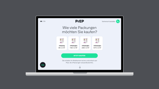
The digital purchasing process is extremely simple for the user. Directly at first glance he knows what he can do on the website and is guided step by step to the completion of the purchase. The user receives important information at any time via the FAQ button and can obtain telephone advice on PrEP via the prominently placed telephone button.
Apotheke Schaffhauserplatz receives the orders directly integrated into its data management system and can thus process the orders efficiently and without complications.
Check out the shop here: www.swissprep.ch
"This project is an important milestone in the digitalization of our pharmacy. Greenliff's claim 'Designing digital future' immediately appealed to me, because with the PrEP shop we are doing just that." Thomas Kappeler, Managing Director Apotheke Schaffhauserplatz
Technology
Gulp, npm, jquery, SCSS, Drupal Webforms, PDF-lib

